ux design + psychology of ux + microsoft excel+ figma
I created a tracker app prototype in my Print Layout and Content design course, using my knowledge of design principles and the Adobe Creative Cloud software.
Before designing anything, I began planning by creating a project brief to define my vision, requirements, and goals for the app.
I then performed research to learn about my prospective users. I completed the following documents to contain and present my findings:
- Learning Plan – To fill in my gaps of understanding about my users’ needs
- Comparative Assessment – To establish the expectations for my app’s user experience by considering how other existing products achieve a similar experience
- User Persona – To flesh out an accurate understanding of a prospective user and help me understand my users from a more personal perspective

After the research and planning phases, I began designing by sketching out paper wireframes. This low-fidelity prototyping helped me to quickly illustrate my ideas for the screens and layouts of my tracker app. I performed some informal user testing with this prototype, asking five people to “tap” through the app experience and provide suggestions and feedback. This enabled me to discard some initial ideas and saved a bit of time in the long run.
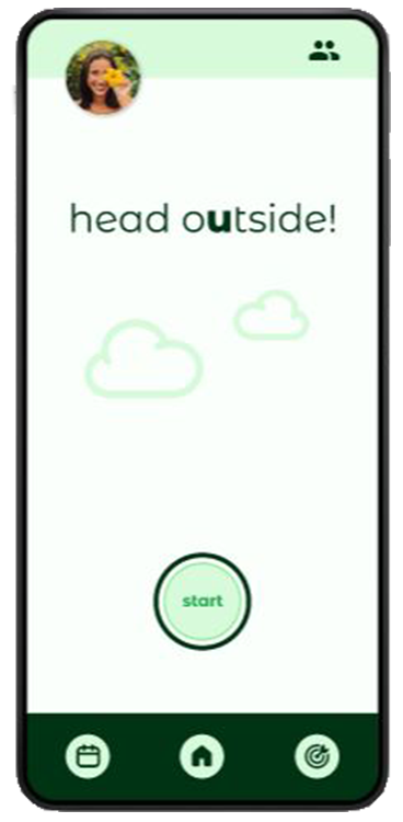
With all of my knowledge of my users and feedback from my user testing, I started to design my high-fidelity prototype in Figma. I first created all of the screens, then linked them together using Figma’s prototyping features. This project was a fun challenge for me. Due to my research and efforts to map out my design in the early stages, I felt like the process went smoother and faster than past app design projects. Tap through my interactive app prototype to view my final design.
I performed more user testing on my prototype, received feedback, and implemented some of the recommended changes. I also created a flyer to evangelize my work, promote my design, and solicit additional feedback.