graphic design + design for print + adobe indesign + photoshop + illustrator
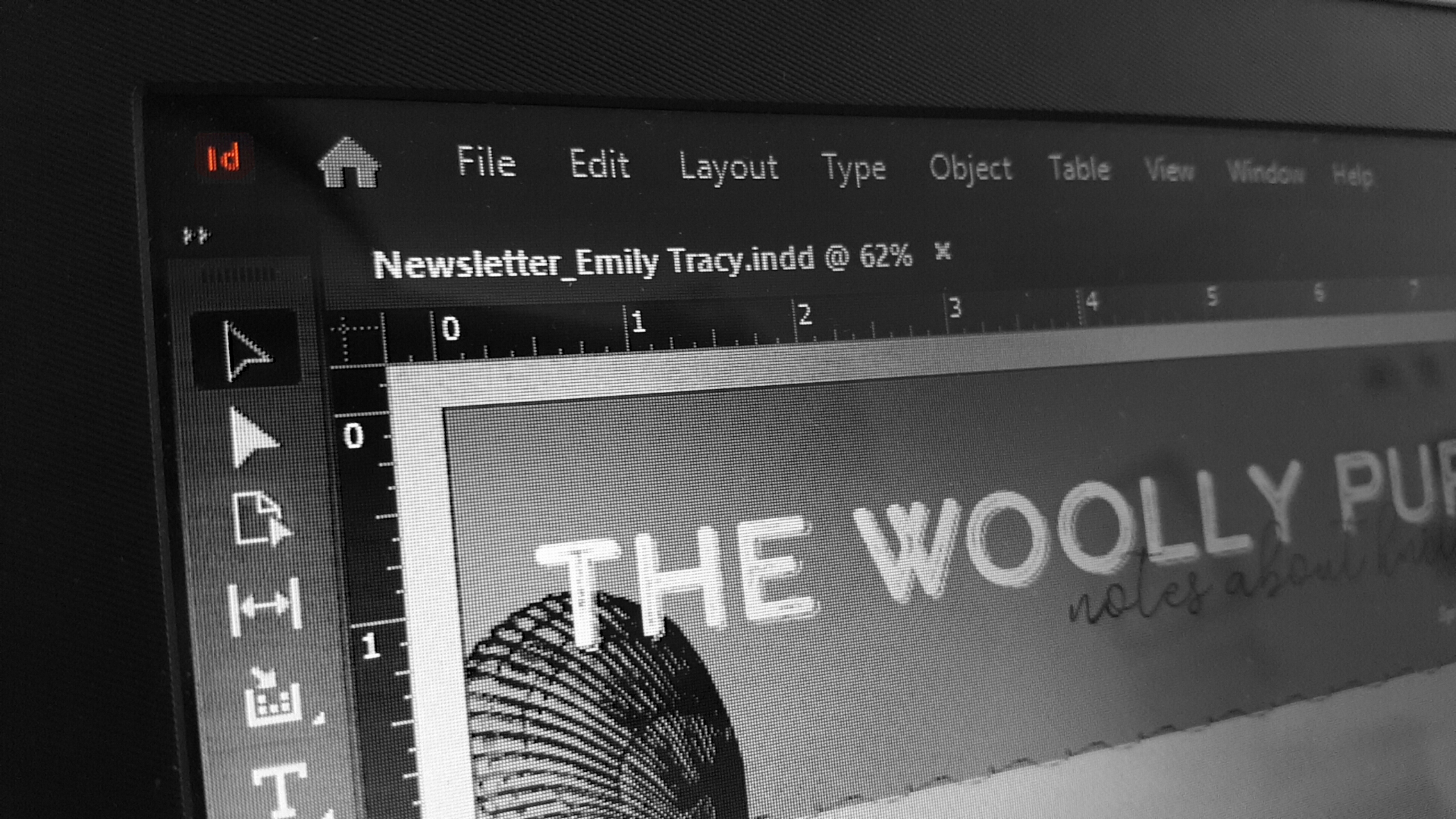
I created a newsletter on knitting in my Print Layout and Content design course, using my knowledge of design principles and the Adobe Creative Cloud software.
For this particular project, the emphasis was less on the content and more on the visual design. That being said, I took care to create, solicit, and edit well-written copy, using the words of family and friends for two of the articles. I chose the topic of knitting, as it is one of my favorite hobbies. Several important aspects that make this design particularly effective are the grid layout, the typography, and the image quality.
I designed my newsletter in a way that reflects my personal tastes, appealing to an audience enthusiastic about crafting. My goal was an elegant, minimalist aesthetic, which I achieved through my font selections, images, and color palette.
My primary challenge in this project was to create a cohesive layout that presented compelling visuals while still emphasizing my content. I spent a significant amount of time using a grid layout in InDesign to move images and text around until I created a design that was balanced, visually appealing, and consistent across every spread.
Ultimately, I packaged my files and design work into a project folder and submitted my work and final newsletter design.
